Data and Visualization
Datablocks
Datablocks is a data visualization and tangible user interface (TUI) research project done at the Visual Analytics lab (OCADu). It was shown at IBM’s CASCON and ACM’s CHI. This design is an iteration of a research project conducted previously at the lab and was arduino-based. The visualization code was rewritten and its design updated.
Physical blocks placed on a table act as tokens that selects which data to be visualized from a dataset. The visualization and interaction was tested with two datasets: radio listeners audience and UN global employment. Bar graphs represent each data category and each category can be broken down by its demographics (age group and gender). A ‘compare’ token allows two tokens to be placed next to it in order to compare their values.
The system uses the TUIO framework to read and parse the token information. A camera placed under the table reads the fiducial mark under each block and a Processing code parses and connects the information to the visualization. The system was also tested with JavaScript and Tableau using the same tokens.
Datablocks was created with the objectives of fostering a collaborative data visualization environment and to serve as an educational tool in schools. A common question asked by researchers at the conferences where it was presented was “how would this system handle larger datasets? Would it need hundreds of tokens?” That question was one of the motivations for the development of the TIME magazine project, showcased bellow.
Code (Bar Graph)
Code (TUI - Bar Graph)
Code (TUI - Tableau)
Datablocks - TIME Magazine
Building on the ideas developed in the Datablocks project and trying to address its main shortcoming - namely, the difficulty to handle larger datasets -, a tangible user interface for navigating and accessing the entire TIME magazine database was designed. It was demoed as a design case at ISEA.
Three tokens are used for navigating through all the issues. One token represents the issue’s decade, another the year and the last the month. Moving the token along the table’s X axis chooses between the available selections. The fourth and last token selects the desired issue and lets the user flip through its pages by rotating the token.
This tangible user interface design could be extrapolated to browsing other large periodical collections or datasets.
Code
Taste Graph Visualization
The taste graph visualization is a topic modelling design research project conducted at the Visual Analytics lab (OCADu). Working with the Globe and Mail, Canada’s largest national daily newspaper, the visualization displays the newspaper’s audience browsing habits. What are the interests of the viwers of the finance section? The visualization answers this question by showing what other sections and sub-sections of the website they visit. Such answers are of interest for the newspaper’s advertising clients and could help them better create and target their ads.
The proposed design was further developed by the subsequent lab research fellow and presented at the Discovery conference in Toronto.
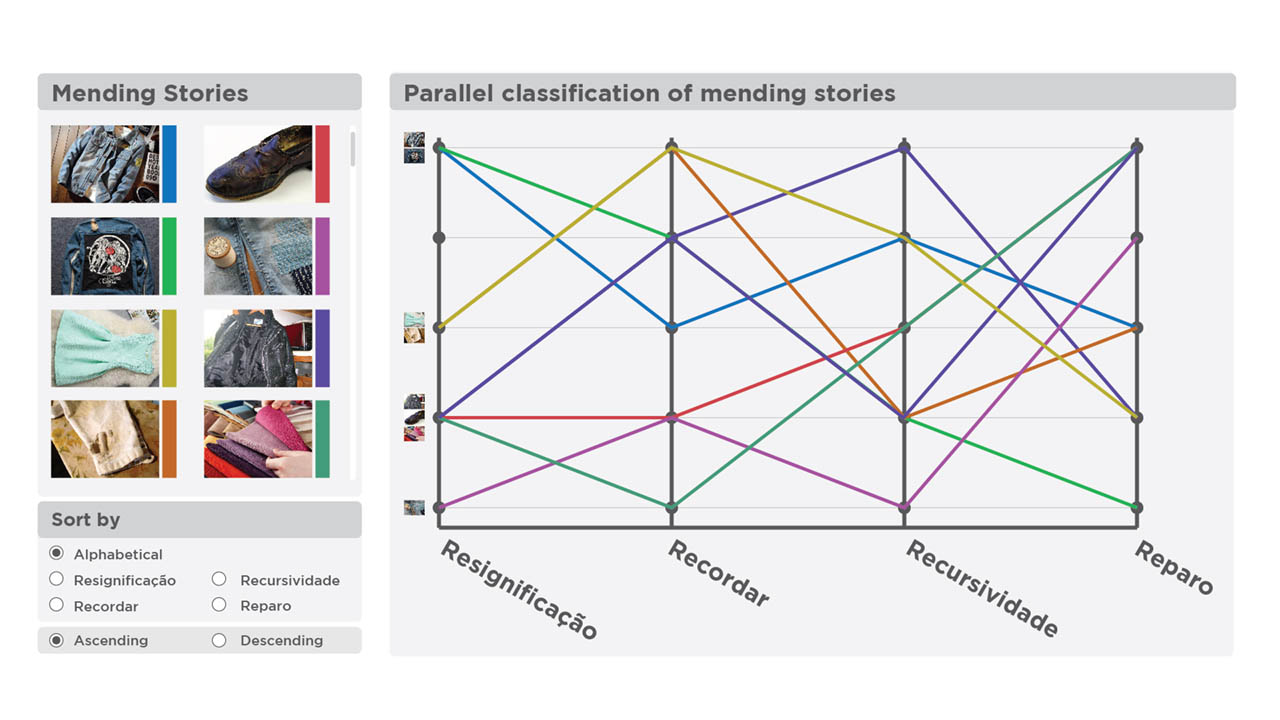
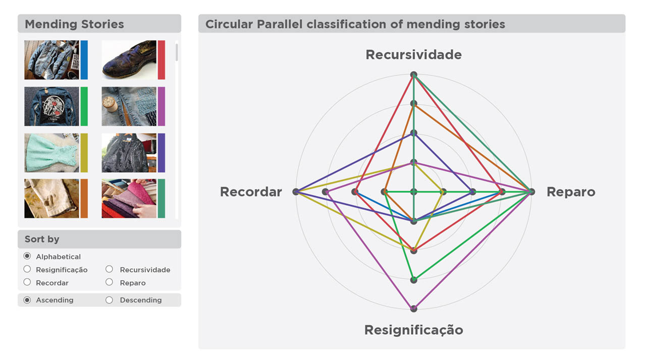
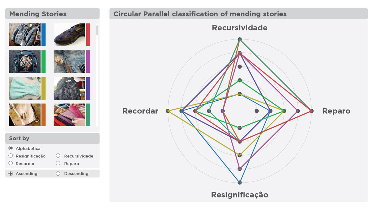
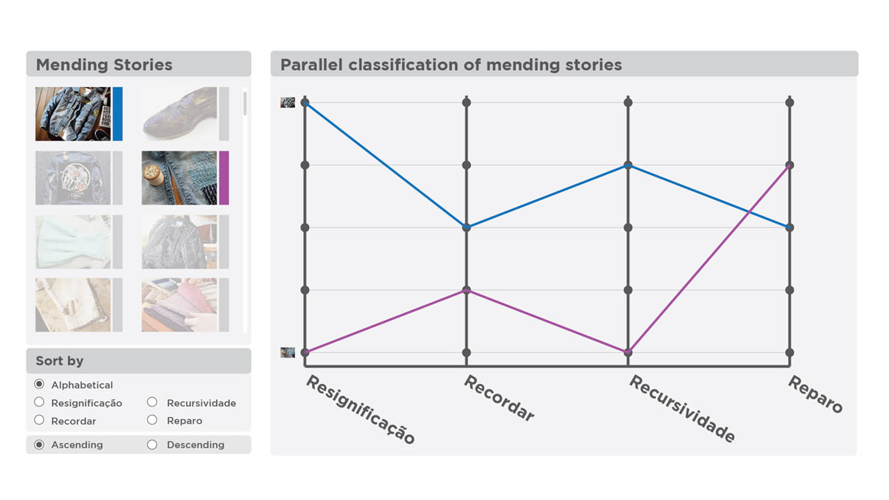
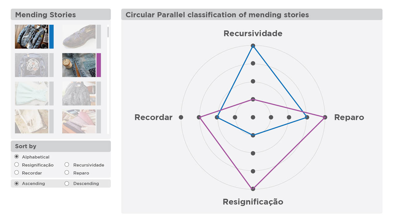
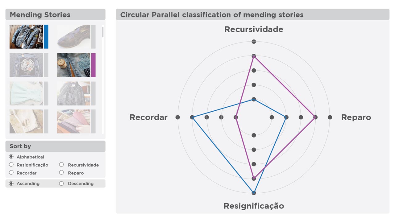
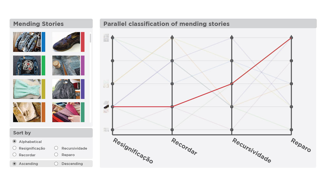
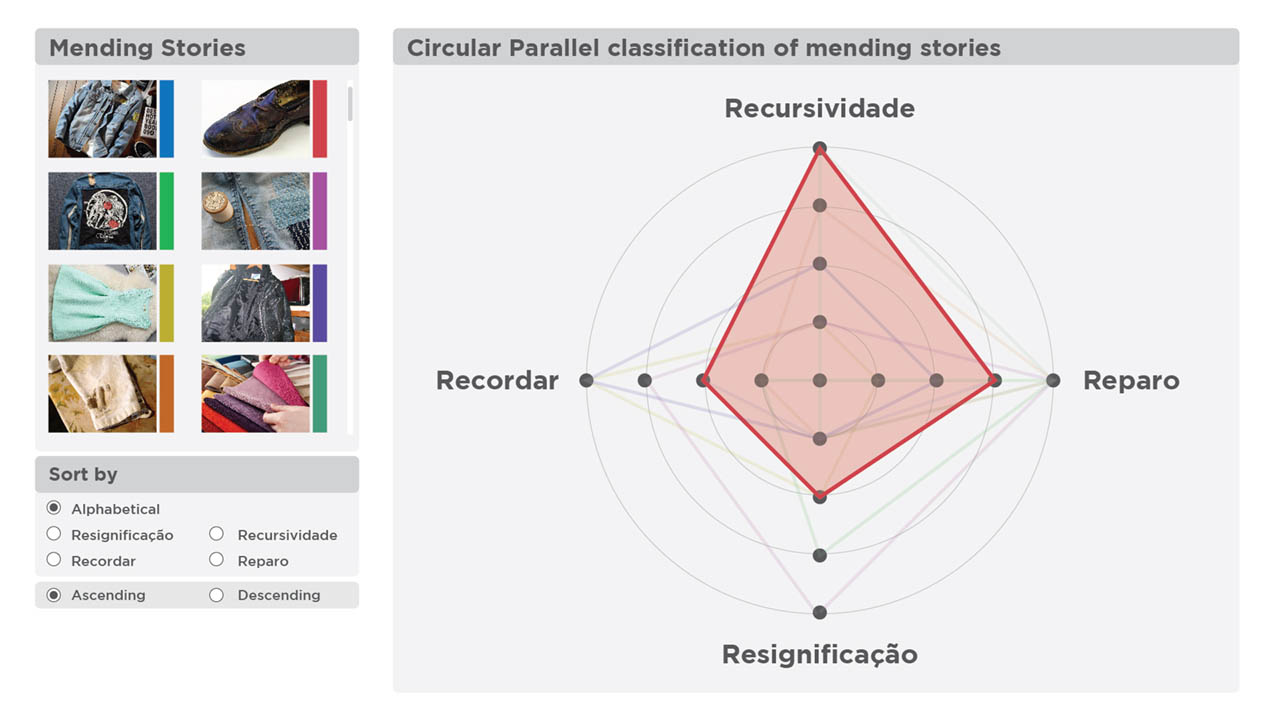
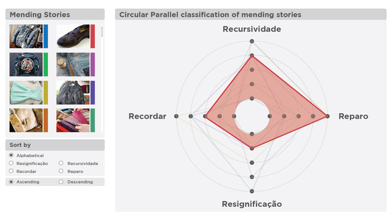
Story Classification
Tactile Visualization Mapping System
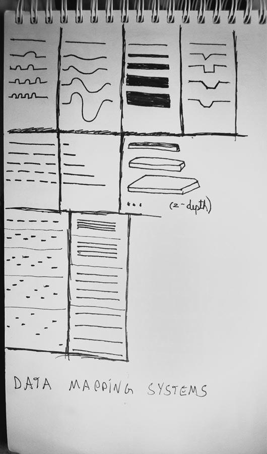
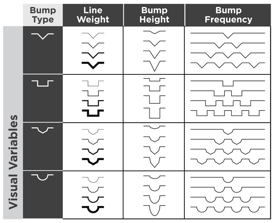
Starting from Jaques Bertin’s idea of visual variables, this research proposes a system of tactile variables that can be mapped to data. Supervised by prof. Isabel Meirelles (author of the book Design for Information) Its main goal is to develop a way for visually impaired populations to read data. Visual representation of data has an extensive literature corpus and applications, whereas alternate modes of representation are way behind in terms of research projects and relevance.
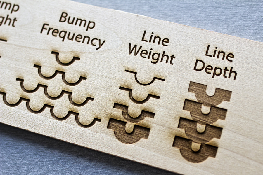
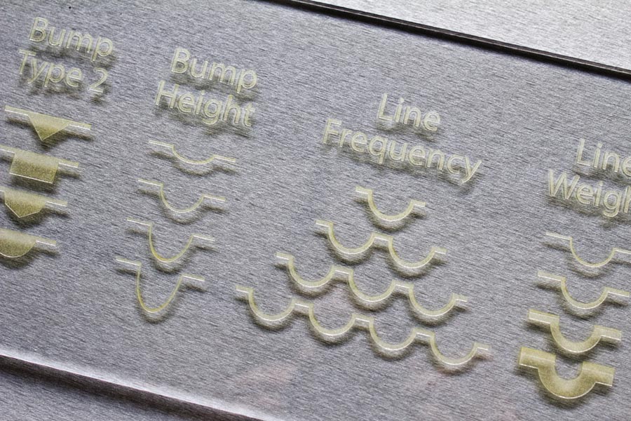
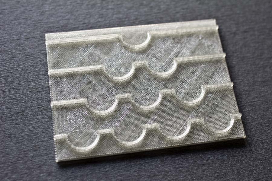
Research started with possible tactile variables such as heat level of a surface and eventually evolved to a more abstract approach. Bumps added to a line. The bump type represents the data category and bump weight, height and frequency its variables.
The three images shown above are the material and process tests - laser engraving on wood and acrlyic and 3d printing were tested. Each process resulted in a very different perceptual result and, ultimately, 3d printing showed to be better suited for the project.
The three images bellow show a process image, a matrix with the variables system and an example data set. As can be seen in the images, the system, in its current form, doesn’t allow a very large resolution.

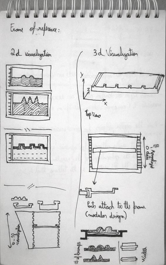
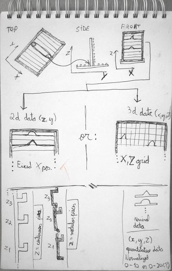
The images bellow show a proposed design using the tactile variables system. Using a modular approach, the laser-cut objects can be placed on a frame. This design soon took a slight different path and the variables, althought the same, had to be approach in a different way.
In the end, user test with the intended target population is still needed to evaluate how effective the variable system is and if the proposed design work as an application of the system.

Read the paper
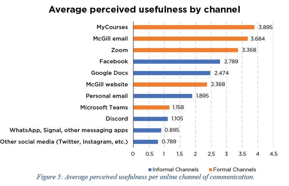
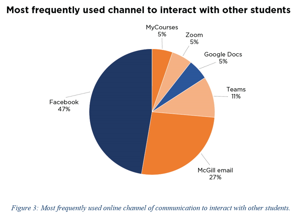
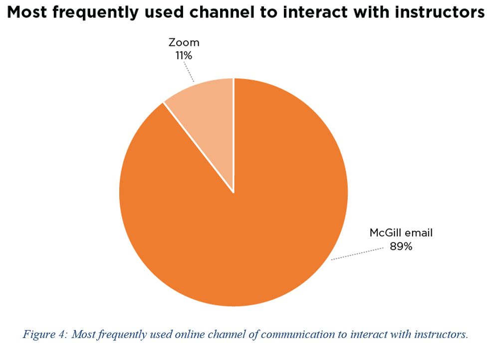
McGill University’s students perceptions towards communication channels

Read the full research
VCV Rack Usability Test
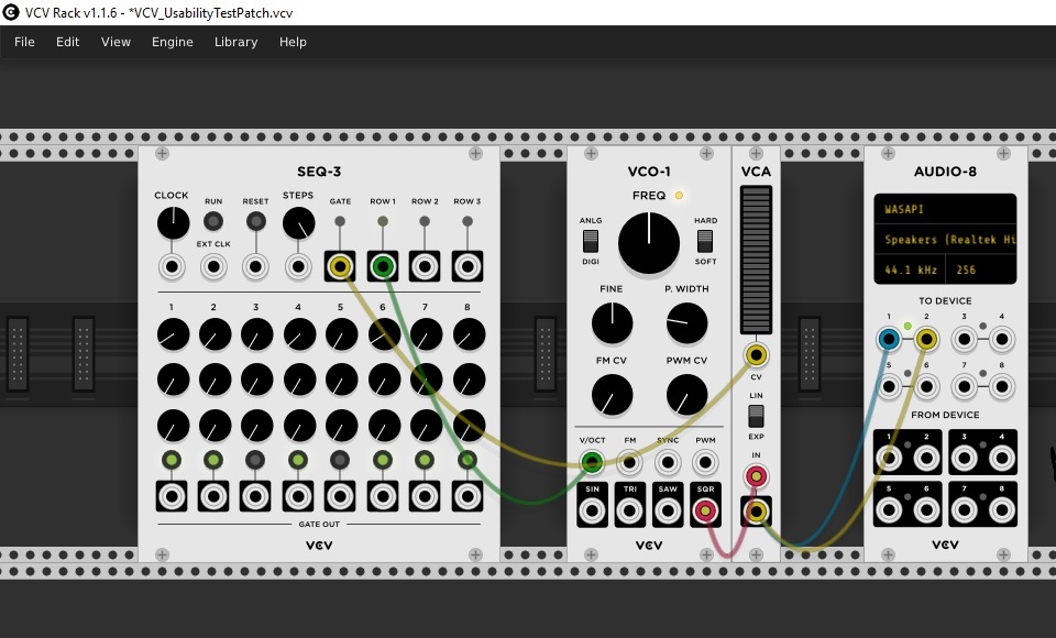
This project was completed as part of a course on Usability Test and Evaluation at McGill University’s Information Studies department.
VCV Rack is a virtual modular synthesizer, a type of sound generating software that mimics its analog hardware counterpart. Modular synthesizers are made from a collection of specialized modules that can be patched together in many different ways, depending on the intented goal. For this research, we were interested in understanding how easy or hard it is for novice users (i.e. individuals who have no experience with synthesizers, either hardware or software, and little to no musical skills) to learn a new, complex user interface. To do so, we developed a very basic patch and users were required to follow a set of instructions: (1) Add one module to the patch, (2) connect the modules, (3) play a sequence of musical notes from the resulting patch (assuming steps 1 and 2 were performed correctly) and tweak that sequence and/or other parameters in the patch. Task completing time was measured and participants had to answer a questionnaire at the end.


Although sample size was low (n=3), the results suggested that the learnability of VCV Rack’s user interface was, at best, moderate. Partipants perceived the interface as complex and tasks that should be relatively straightforward, such as adding a new module, proved to be complicated to the users. The usability test resulted in a few suggestions that could improve the user experience of novice users and included new ways to access the module library as well as improvements to the module library itself; improved usability when users attempt to connect modules together; improvements to the sequencer module (none of the participants were able to run the sequencer).
Since this was an academic project, we had no access to the VCV Rack development team. But, interestingly, a few days before we presented the results of the usability test, VCV Rack 2 was released and included some of the suggestions we had proposed, such as better user feedback when the cursor hovers over critical parts of the user interface.
Read the full report
Data-Driven AV System
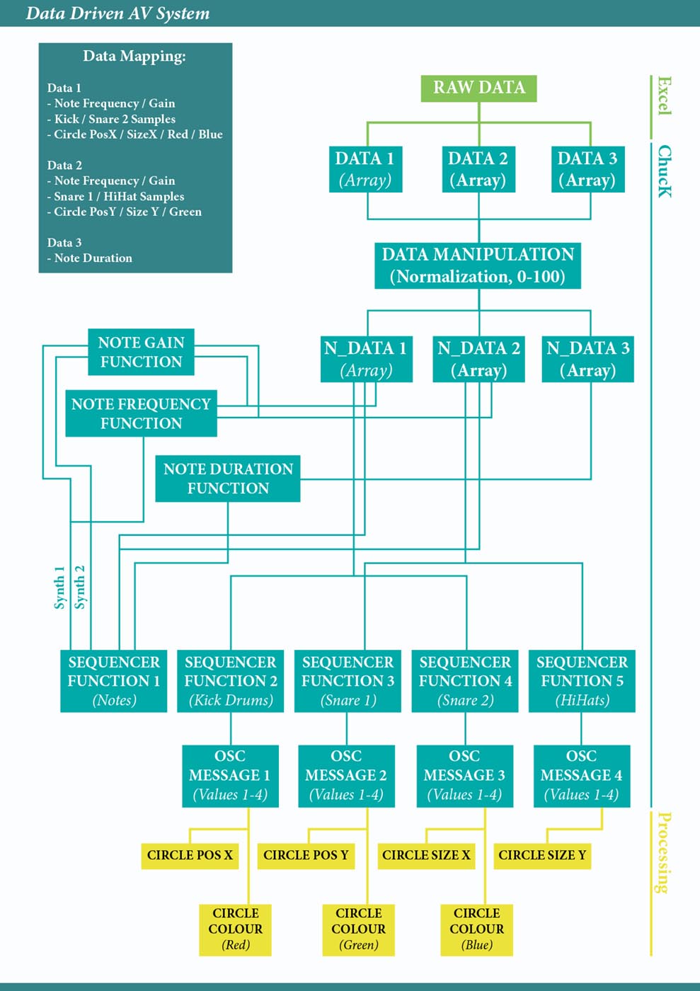
An artistic visualization project that uses an audio-visual system to let people feel data in a multisensory way. It uses life expectancy data from the online UN repository and maps it to the system’s variables such as audio pitch, trigger drum sounds and color and position of the visuals.
The audio portion of the system follows a similar approach to some audio sonification projects - a low value is represented by lower pitches and as the values gets higher, so does the pitch. But instead of using a continuous pitch variation, it uses the stepped resolution of MIDI notes in a compromise of data accuracy for musicallity.
The visualization follows the same dataset and each data point is triggered at the same time for both audio and video. The aim is for users to start making connections between the audio notes and the abstract visuals. Future work on the system would fine tune the visuals to facilitate the mental connection between audio and video.
Code (Audio)
I’m a motion & information designer for digital marketing and science communication based in Montreal.
t: 438 937 5651
e: stephenkeller1br@yahoo.com.br
e: stephenkeller1br@yahoo.com.br


